What’s Better: Lifestyle or Stand Alone Images? How to choose the best image style for your products
Raise your hand if, when it comes to deciding on the best imagery to highlight your products you get a little stuck. Some websites you’ve seen only seem to feature products on a plain background (traditionally white, but some brands utilize other solid colors) but others are all about the lifestyle shots. What's a girl (or guy) to do??
When you have the option to feature more than one image per products (whether on your own website or a third party's, like Etsy) it can be challenging to know which images are going to get you the best reactions and most clicks that lead to a purchase. Today, I’m going to talk about each type of an image so you can come up with a plan that is best for showcasing your unique products and designs.
Lifestyle Images:
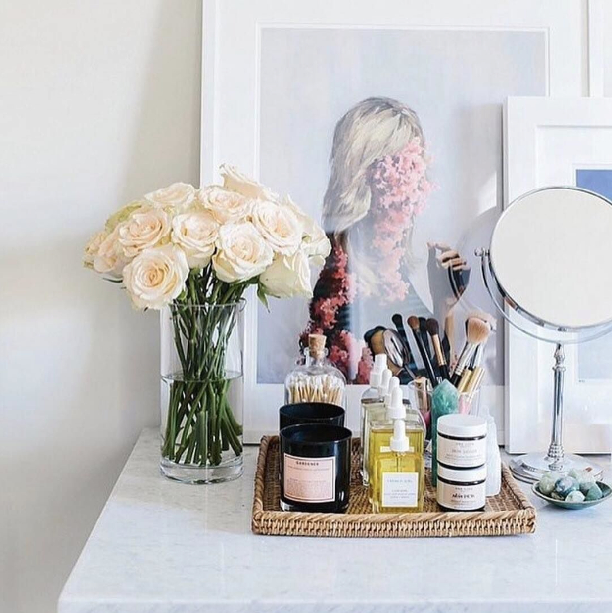
Lifestyle images are those that are styled with complementing backgrounds/props that help your customer envision what their life is like when they use one of your products. When your customer can see themselves wearing/using/displaying something you’ve created they become emotionally connected to that feeling that you've created or the lifestyle you've helped them envision which can encourage them to hit that add to cart button.
Letterfolk is one company that does an amazing job at setting the tone for their products via images of their products in action throughout their customer's homes. Looking through their Instagram feed always makes me want to hit buy because I too can see one of their signs hanging on the wall in my home
One Love Organics is another brand that does an excellent job of painting a picture of what their customers feel when using their products. They effortlessly weave the theme of relaxation throughout their feed via their imagery and color palettes.
Stand alone Images:
When you shoot your product on a plain background you’re allowing people to really focus on your product and all its awesome details because people won’t be distracted by the other props or items in your frame. Have you ever featured a styled image and someone asks you, “Hey! Where’d you get that (calculator/picture frame/notepad insert anything other than your product here) or “ Do you also sell the (again, insert anything other than your product here)?
While solid white is a popular go to you can incorporate things like marble, wood or different color solids. As long as your background doesn’t compete with or distract from your product you’ll be all set.
My Friend Amy, owner of Paper Finch Design uses these types of images in her Etsy shop. She does an awesome job at highlighting her products so you can focus on the detail in her custom prints + designs. (Seriously though, her stuff is AHHMAZING!!)
Lucky 3 Farm does something really cool with their images. In addition to utilizing a solid white background, they shoot their products outside on a rustic table. This little bit of extra dimension perfectly compliments their fresh from the farm products but doesn’t take anything away from the product itself, making for a clean and crisp product shot.
Now that we’ve talked a bit about the two types of images you should use to highlight your products here are some different ways you can use each type!
Lifestyle photos are perfect for:
- Your blog posts
- The cover + some interior pages of your catalog
- The cover of your line sheet
- Your press kit
- Print advertising
Stand alone Images are perfect for:
- Your website’s shop page
- Your Etsy store
- The interior pages of your catalog
- Your line sheet
- If you sell (or want to sell) to other online retailers (many will ask you to provide images on clean white backgrounds)
Ideally, you should be aiming to have a combination of both styled and stand alone images on file. For every product you want to sell on your website or Etsy I recommend having at least one stand alone image so your potential customers can really see all the detail you’ve put into your creations + designs. Then, if you want to include a styled image in your product listing you can do so without the risk of your customer being distracted by the other elements in your photo.


